Studio Notes
One Property. One Story. Four Places to Tell It.
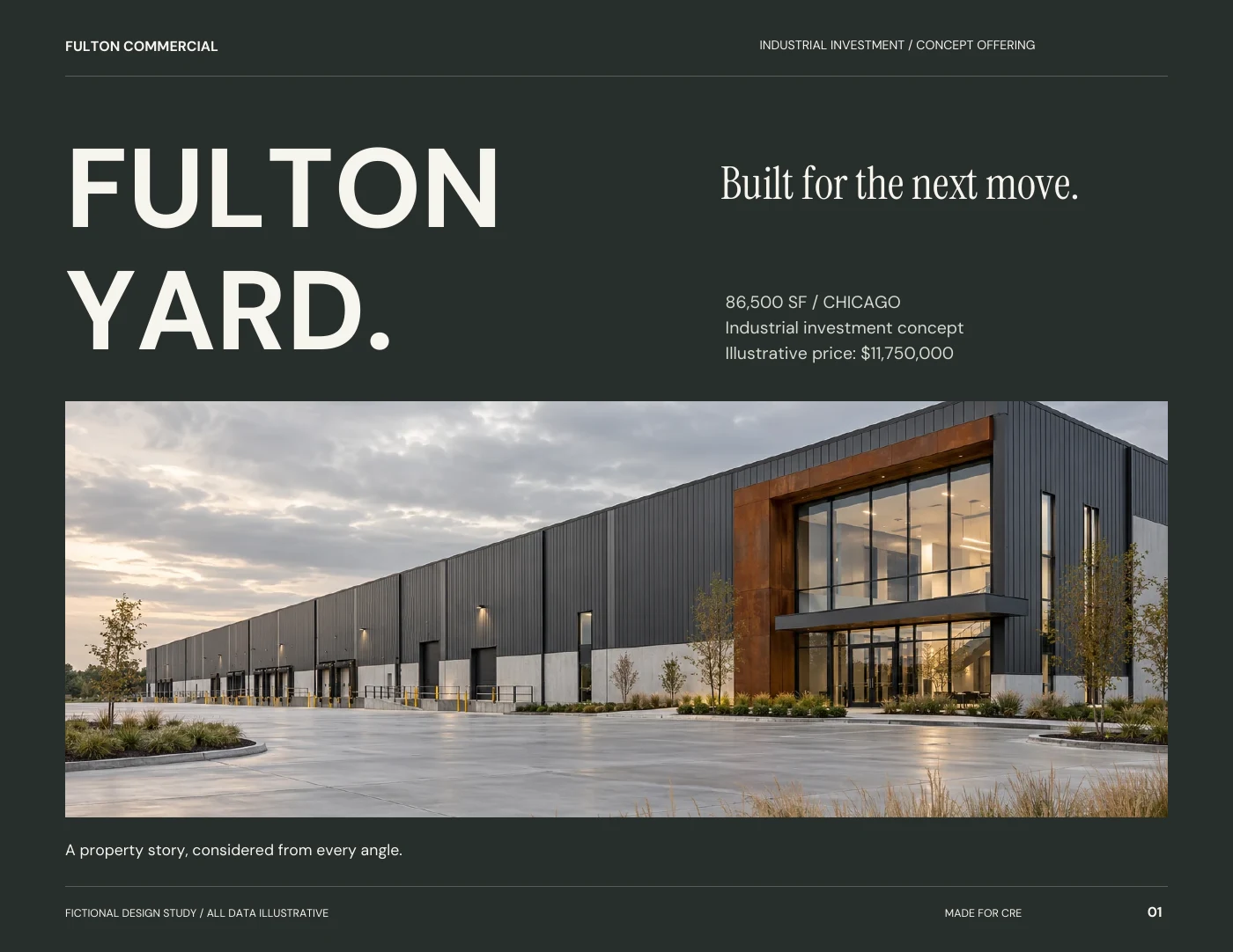
A look inside our Fulton Yard studio study: how one approved fact set shapes an offering memorandum, email, search ad, and property page.

In this field note
For our Fulton Yard study, we began with a deliberately ordinary problem: a property team needs a credible offering memorandum, a useful email, a focused search ad, and a landing page. Four different formats. One investment story. Here is how we connected them, and where we chose to let them differ.
The brief starts with an audience, not a layout
Fulton Yard is an original fictional studio study. Its industrial building, tenancy, financial figures, and AI-generated architecture were created to demonstrate a complete marketing approach. It is not a delivered client assignment or an investment offering.
We framed the audience as industrial investors and their buyer representatives. That choice determines what deserves space: the building configuration, occupied area, lease profile, operating assumptions, and the records a reader would need before taking the analysis further. Decorative copy has to earn its place.
The creative brief: make the opportunity easy to understand, make the assumptions easy to find, and make the next step obvious.
Build one fact set before building four assets
We used 86,500 SF, 94% occupancy, and an illustrative $11,750,000 price throughout the study. Three occupied suites total 81,310 SF; the remaining 5,190 SF is vacant. Those figures stay consistent in the memorandum, campaign email, and landing-page preview.
The memorandum takes the financial explanation further. Potential base rent is $1,038,000. After a 6% vacancy allowance and $120,000 of recoveries, effective gross income is $1,095,720. The expense lines total $275,720, producing the same $820,000 illustrative NOI used in the summary and sensitivity table.
The design lesson is not the assumed valuation. It is the ability to move between pages without wondering which number is current. For a real campaign, we would start with an approved client source and carry its version through the entire set.
- Keep area, occupancy, price, and reporting period consistent.
- Label illustrative, projected, and verified figures differently.
- Reconcile subtotals before a designer begins polishing the table.
The memorandum earns the detailed read
The 12-page document has a deliberate sequence: first impression, executive summary, investment narrative, specifications, tenancy, financials, sensitivity, site organization, occupier context, diligence index, next steps, and closing identity.
Large serif headings create an editorial pace. Dark table headers and restrained alternating rows help a reader follow the numbers. Rust distinguishes the property identity without turning every metric into a competing accent. The schematic site diagram is labelled as a concept, rather than borrowing the visual authority of an actual survey.
The email earns a click. The ad earns relevance.
The email presents the property name, a concise headline, three facts, and one route to the memorandum. It does not attempt to fit the full financial narrative into an inbox.
The search-ad preview uses a direct industrial-investment description and a relevant destination. Before a real campaign, the audience, location targeting, budget, exclusions, inquiry route, and platform requirements would need to be confirmed. This study illustrates the creative, not campaign performance.
The landing-page composition shares the identity and image treatment, but gives the reader enough context to decide whether to continue. Its call to action opens the actual sample document. A beautiful button is useful only when the next step delivers what it promises.
Review the journey as one piece of work
The most useful review crosses file boundaries. Does the email promise the same opportunity the page explains? Does the document use the same area and price? Does a mobile reader have a useful path to the full material? Can the person receiving an inquiry tell which campaign generated it?
For the studio study, we checked arithmetic, document rendering, download links, responsive layouts, and interactive campaign previews. For a live engagement, the review would also require factual approval from the client, tested lead delivery, and a shared definition of a qualified inquiry.
One identity creates recognition. One approved fact set creates consistency. A clear journey connects both to the next conversation.
Explore the work and services
Ideas for your next website or property campaign?
We would be glad to help you bring them to life.

Good work starts with a conversation
Put the thinking to work.
Connect your brand, digital presence, and next campaign with a marketing partner focused on commercial real estate.